
Typography is more than just selecting fonts; it’s an art form that shapes how we perceive information. In this article, we explore the history, types, and best practices of typography in the context of graphic design.
Introduction to Typography
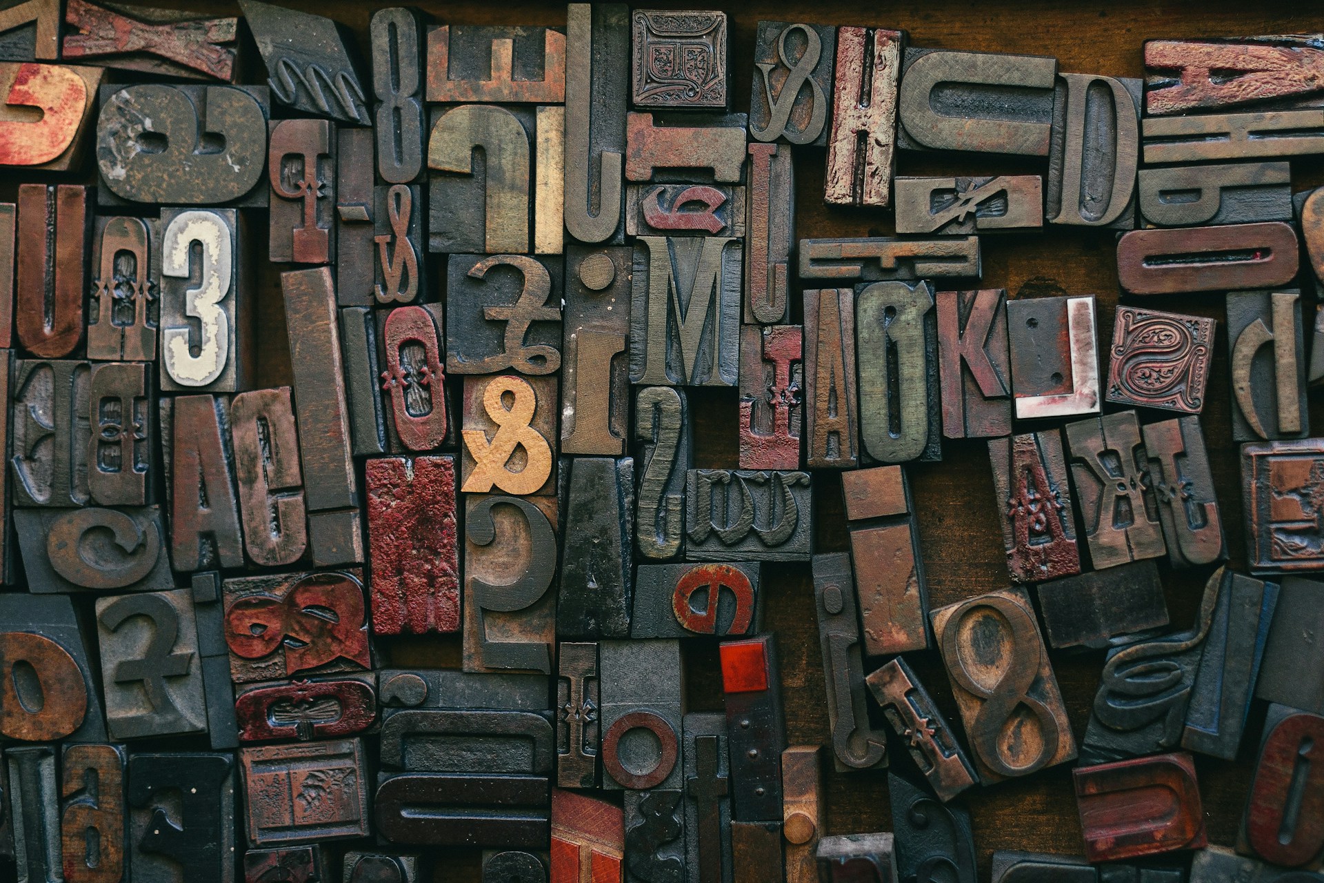
Typography is the art of styling and arranging text. Whether it’s for a poster, a book, product packaging, a website, or a business card, typography plays a crucial role in determining how text is displayed and perceived by the reader. It goes beyond aesthetics; typography ensures that text is legible, accessible, and on-brand, allowing effective communication of key messages to the target audience.
Here are some key points about typography:
- Definition: Typography involves arranging letters and words in a visually appealing way.
- Elements: It includes choosing the right typeface, adjusting font size, colors, and shadows, and managing spacing between letters, words, and lines.
- Importance: Typography makes text more than just visually pleasing; it ensures readability and professionalism.
Remember, good typography can elevate your design and enhance communication!
A Brief History of Typography
From ancient hieroglyphs to Gutenberg’s movable type, typography has evolved significantly:
- Hieroglyphs & Cuneiform:
- Egyptian hieroglyphs first appeared around 3000 BC. These intricate symbols were painted onto plaster and later carved in relief. However, they were primarily used in religious or royal contexts.
- Hieratic script, a simplified version of hieroglyphs, emerged for official documents. It was written in ink with a reed brush.
- Cuneiform, developed by the ancient Sumerians (3500-3000 BC), was one of the earliest writing systems. It involved wedge-shaped features made by pushing a reed into wet clay tablets.
- Moveable Type & Printing Press:
- The 15th century saw a significant leap with Johannes Gutenberg’s invention of the movable printing press. This groundbreaking innovation facilitated the mass production of typographic designs and enabled the widespread distribution of visual communications.
- Woodblocks and then movable type revolutionized typography, making it accessible to new generations of designers and users.
- Digital Age:
- Digitization further transformed typography, allowing for dynamic changes driven by modern technology, including the internet and smartphones.
Typography’s journey—from swan feathers to Helvetica—has shaped our visual culture and continues to evolve!
Popular Types of Typefaces
Understanding typefaces is essential for designers:
- Serif Fonts:
- Didot: An elegant, high-contrast serif font with a rich history dating back to the 18th century. It exudes sophistication and is often used in classy logo designs.
- Bodoni: Known for its geometric styling and unbracketed serifs, Bodoni is a timeless typeface. It famously graces the Vogue logo.
- Baskerville: A transitional serif typeface designed by John Baskerville in the 1750s. It combines classic elegance with readability.
- Sans Serif Fonts:
- Helvetica (Neue Haas Grotesk): Universally beloved, Helvetica is a clean, versatile sans-serif typeface. It’s used extensively in branding and print design.
- Futura: A geometric sans-serif font with a modern, minimalist feel. It’s popular for its simplicity and legibility.
- Arial: Similar to Helvetica, Arial is widely available and commonly used in digital media.
- Decorative Fonts:
- Trajan’s Column: Inspired by the ancient Roman square capitals, this typeface conveys authority. It’s rarely used today but has historical significance.
- Script Fonts: These ornate, cursive fonts add flair and elegance. They’re often seen in invitations and luxury branding.
Key Elements of Typography
Master these elements for effective typography:
- Typefaces and Fonts:
- Typefaces refer to the overall design of a set of characters (e.g., Times New Roman, Helvetica).
- Fonts are specific variations within a typeface (e.g., bold, italic, regular).
- Kerning:
- Kerning adjusts the spacing between individual letters to ensure balanced visual harmony.
- Proper kerning prevents awkward gaps or overlaps.
- Tracking:
- Tracking (letter spacing) affects the overall spacing between characters in a word or line.
- Adjusting tracking impacts readability and aesthetics.
- Leading:
- Leading (line spacing) determines the vertical distance between lines of text.
- Optimal leading ensures legibility and prevents overcrowding.
Typography Best Practices
Follow these guidelines:
- Choosing Appropriate Fonts:
- Select typefaces that align with the brand and purpose.
- Consider readability and aesthetics.
- Font Sizes and Line Spacing:
- Use consistent font sizes for headings, body text, and captions.
- Adjust line spacing (leading) for readability.
- Font Pairing:
- Combine complementary fonts (e.g., serif with sans-serif).
- Ensure harmony and contrast.
- Hierarchy:
- Prioritize information using font weight, size, and color.
- Guide the reader’s eye through the visual hierarchy.
Remember, good typography enhances communication, leaving a lasting impression on your audience.
Check out more articles!


One response to “Master Typography: 20 Essential Guidelines for Designers ”
[…] Typography plays a great role in helping you to define your brand and can help you in branding your business. Let’s see how it helps: […]